Year
2024
Client
MERTRA®
Category
Web Development
Product Duration
3 Months
Mertra is an Australian streetwear brand growing quickly since launching in 2022. Despite +22% YoY traffic, their eCommerce conversion rate lagged at just 0.9%, while checkout abandonment hit 68%—especially among mobile shoppers. Users also reported low trust: unclear product specs, no warranty info, and surprise shipping fees.
This case study is about one core goal: boost conversion and trust by simplifying mobile shopping and clarifying purchase details.

To uncover what blocked conversions and eroded trust, I led a mixed-method research sprint combining analytics, interviews, heuristic audits, and competitive benchmarking.
Quantitative Analysis
Google Analytics + Hotjar:
• 59% of traffic came from mobile, yet most users didn’t scroll past the hero section
• Low engagement with spec tables, despite 80% of support tickets being spec-related
• Checkout abandonment peaked at the shipping cost reveal stage
Qualitative Interviews (n=15)
We spoke with a mix of loyal customers, first-time buyers, and high-intent drop-offs. A recurring theme: users didn’t trust the brand enough to buy, mainly due to missing shipping info, unclear specs, and lack of warranty visibility.
Heuristic Audit
Overloaded navigation with redundant CTAs
Product pages lacked clarity on payment, sizing, and delivery
Visual inconsistency damaged credibility
Competitive Benchmarking
Analyzed 5 direct competitors and industry leaders. Common practices Mertra lacked:
Upfront shipping and return policies
Financing options
User-submitted photos and reviews
Key Personas
Persona | Goals | Frustrations | Behavior Patterns |
|---|---|---|---|
Jordan (23, Student) | Find trendy, affordable pieces on mobile | Gets confused by inconsistent sizing and poor mobile UX | Shops from Instagram, expects Apple Pay & fast checkout |
Chris (28, Streetwear Collector) | Purchase limited drops and compare fit/sizing | No reviews or real product photos; unclear shipping timelines | Enters via product link, skims details, high AOV |
Maya (31, First-time Buyer) | Buy a gift, feel confident in quality & return policy | Doesn’t see warranty info or shipping estimate until late | Bounces quickly if trust isn’t established early |
I translated these findings into targeted changes on critical pages:
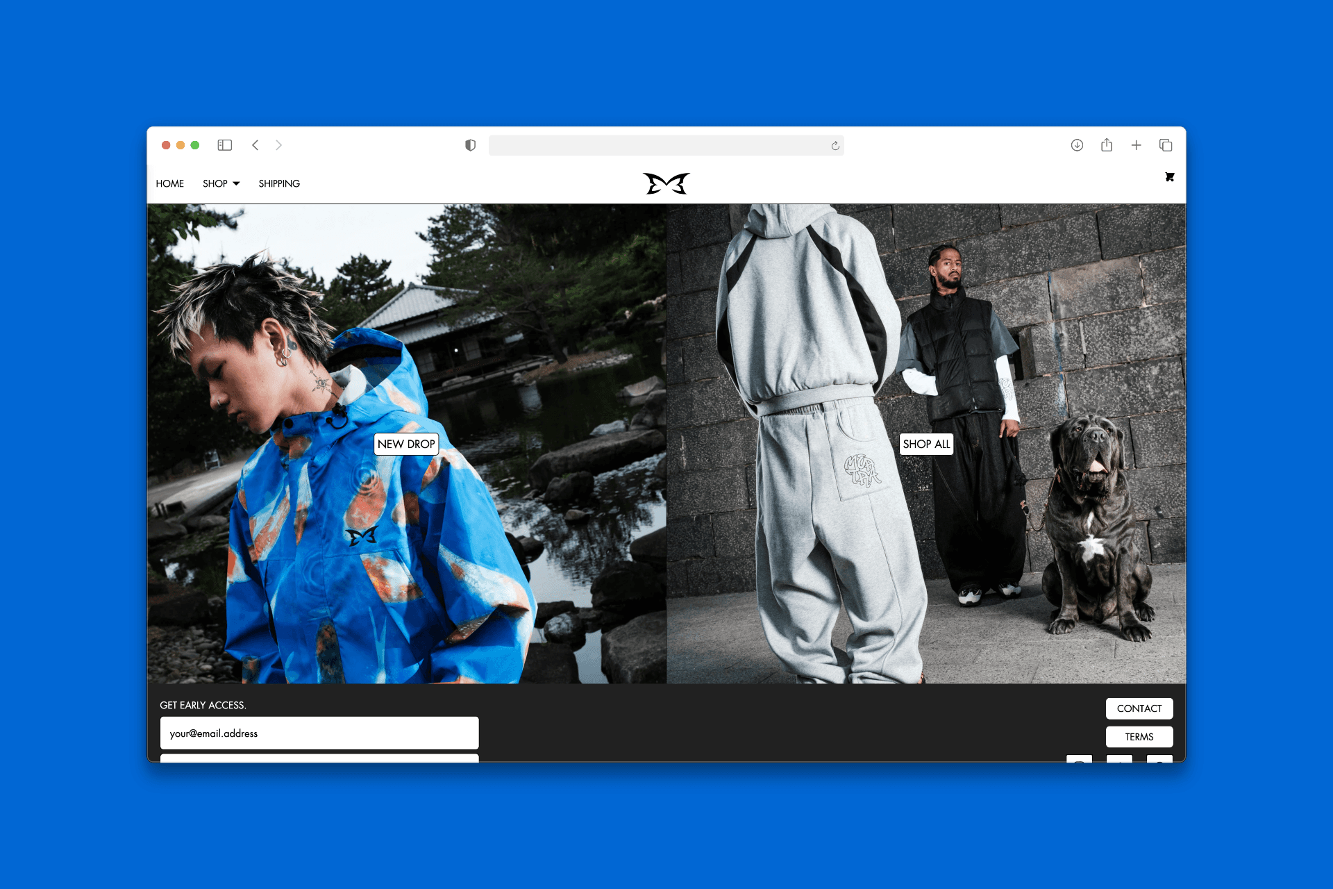
Homepage & Navigation
Implemented a hero section with dynamic promotional text
Added visible trust badges (warranty, payment icons) and review links
Simplified nav from 11 to 5 clear categories (“Hoodies,” “Jackets,” etc.)
Added persistent search with SKU predictive text, catering to seasoned buyers
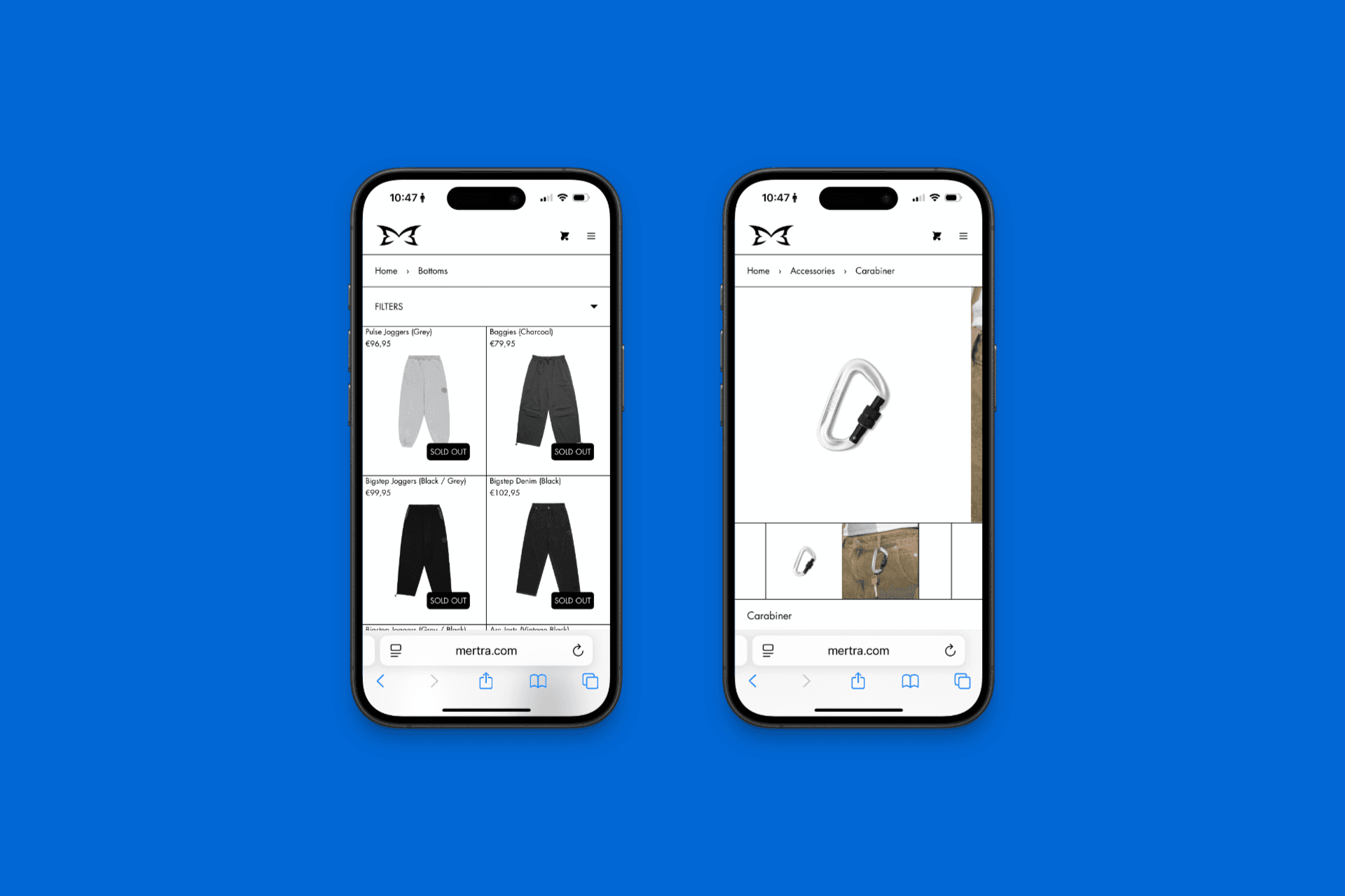
Product Pages
Introduced mobile-friendly spec tabs for quick technical info access
Added financing options and shipping cost estimates directly under the price
Switched to optimized WebP images to improve load speed
Checkout Flow
Redesigned into a clear 2-step flow (Shipping → Payment) with real-time UPS shipping estimates
Added progress indicators and SSL secure-checkout microcopy
Brand Look & Feel
Created a modern, utilitarian design system: bold sans-serif headers, vibrant red accents, consistent automotive-inspired icons
Applied the system across banners, emails, and post‑purchase messaging
Within 90 days of launch, data-driven performance metrics showed clear impact:
Metric | Before | After | Change |
|---|---|---|---|
Conversion Rate | 0.9% | 2.6% | +189% |
Checkout Abandonment | 68% | 41% | −27 points |
Mobile PDP Scroll Depth | — | +55% | increased |
PDP CTA Clicks | — | +2.1× | increased |
Support Tickets (Product Specs) | — | −47% | reduced |
Average Order Value | — | +16% | increased |
Data visualization: