Year
2024
Client
Power Driven Diesel
Category
Web Development / UI, UX
Product Duration
2 Months
Power Driven Diesel had a high-traffic site—but it was cluttered, confusing, and slow to navigate. Users struggled to find products, and drop-off was high before checkout.
The core issue: a disorganized layout and unclear navigation were getting in the way of revenue.
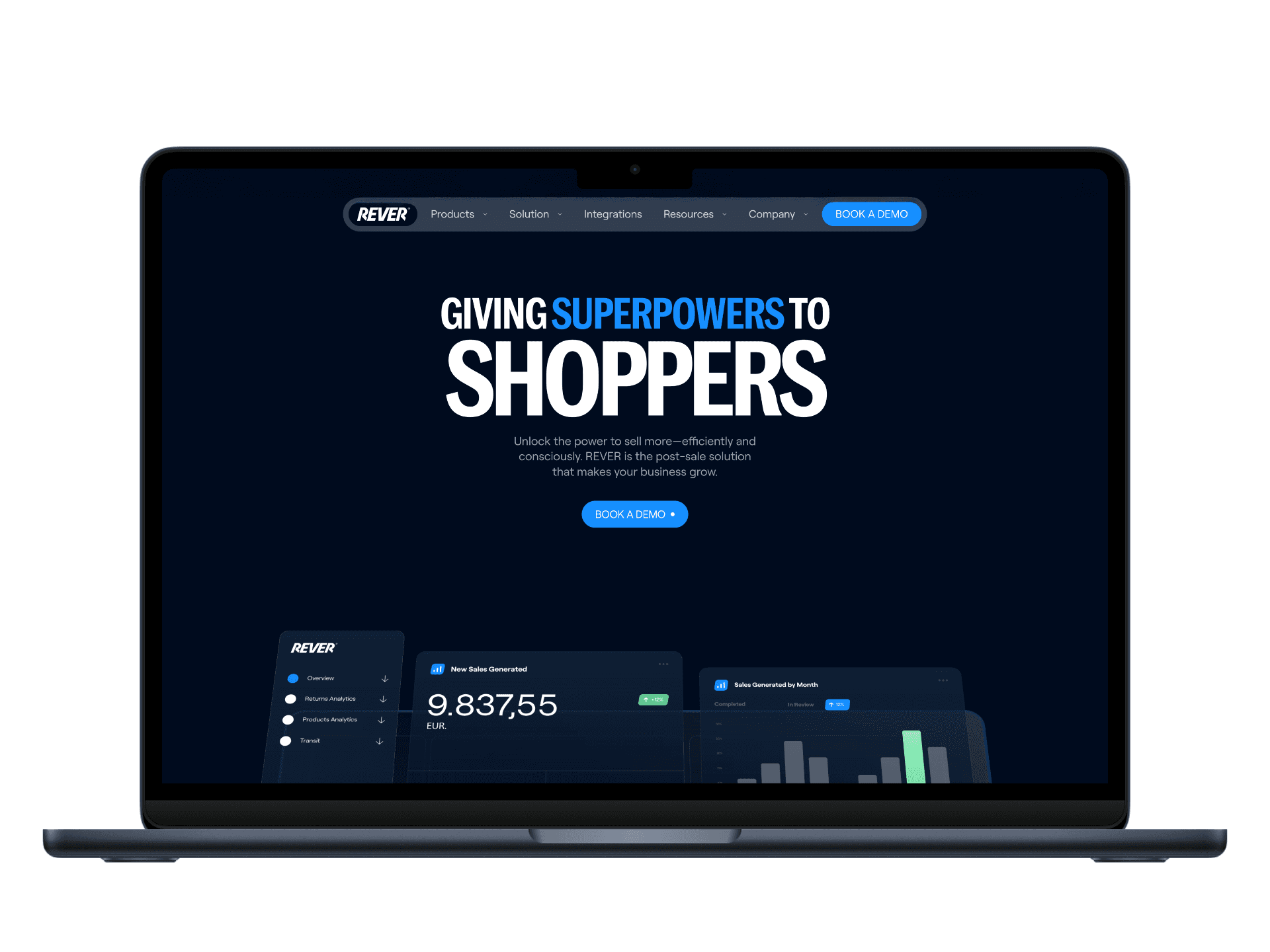
I was brought in to fix that — not with trendy visuals, but with UX decisions that made finding and buying performance parts faster and easier.
To identify where users were getting lost, I conducted a full diagnostic:
UX Audit: Flagged visual clutter, inconsistent UI patterns, and redundant CTAs
User Interviews (n=10): Users said they “didn’t know where to start” or gave up mid-search
Competitor Review: Benchmarked against leading automotive eComm sites to define UX standards
Stakeholder Sessions: Clarified business goals (boost AOV and reduce bounce rate), which shaped design priorities
Persona | Goal | Frustrations |
|---|---|---|
Mike (33, DIY Tuner) | Find compatible parts fast | Navigation is too deep, search results cluttered |
Tina (41, First-Time Buyer) | Understand what fits her truck | Product info too technical, unclear hierarchy |

UX Strategy
Reduced navigation layers and simplified categories
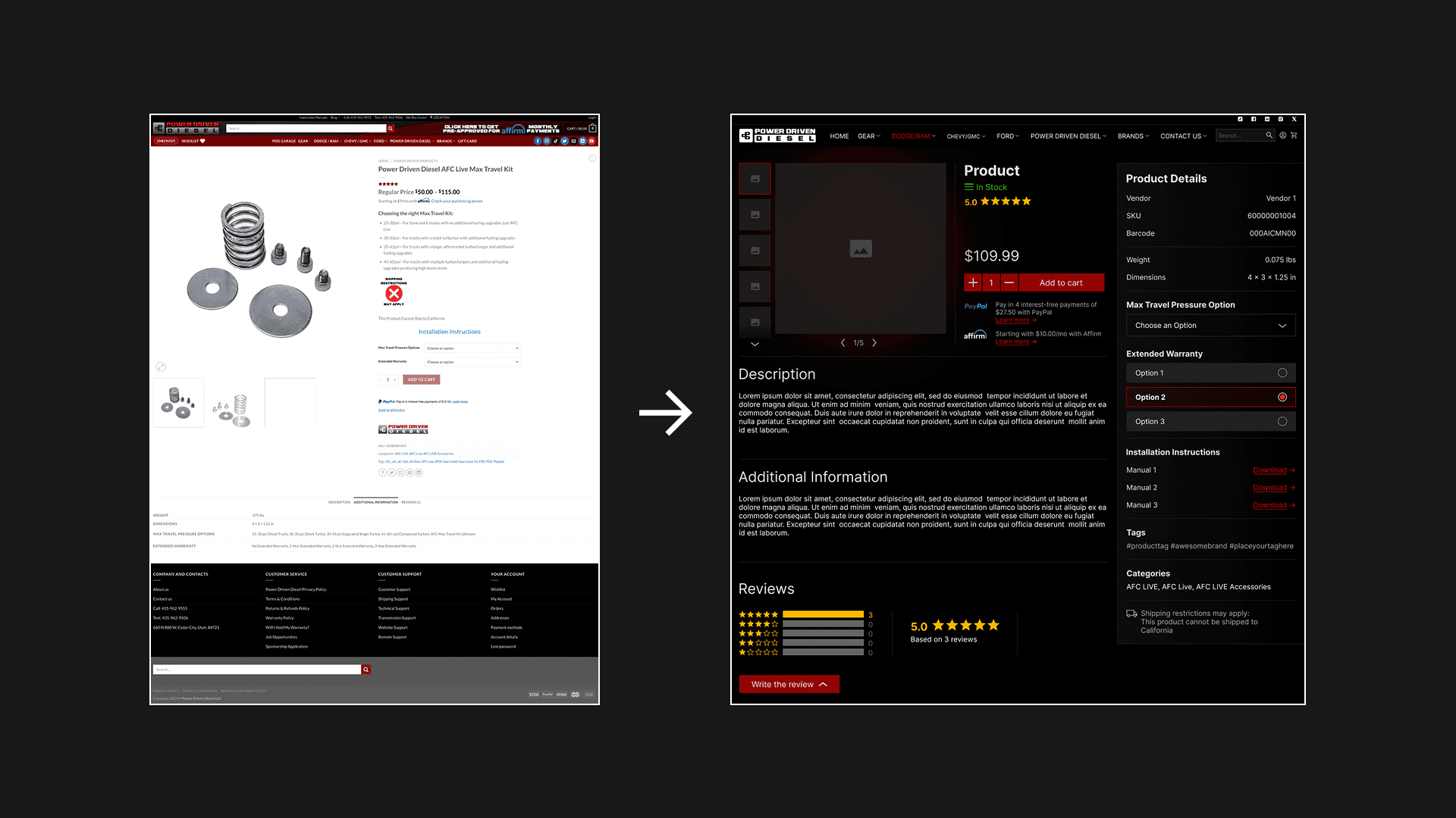
Reorganized product detail pages for clarity and skimmability
Decluttered layout with added whitespace and streamlined touchpoints
Wireframes & Testing
Built low-fi and high-fi wireframes in Figma
Ran A/B tests on homepage and product flow
Iterated based on feedback — especially around search, filters, and content grouping
Visual Design
Created a cohesive UI system:
• Modern, bold typography for technical confidence
• Clean color palette tied to the brand’s rugged image
• Micro-animations to guide interaction without distraction
Dev Handoff
Created reusable components for developers (PDPs, menus, buttons)
Participated in QA and post-launch testing to ensure design integrity held up in production
While testing prototypes in Maze we've achieved these results:
Metric | Before | After | Delta |
|---|---|---|---|
Time to Complete Tasks | — | −35% | faster |
Bounce Rate | — | −20% | improved |
SUS Score | 62 | 83 | +21 points |
User Feedback | — | 90% positive | improved trust/navigation |