Year
2025
Client
Project Demeter
Category
Web Development / UI, UX
Product Duration
3 Months
Food waste isn’t just an economic issue—it’s a climate one. Globally, over 1.3 billion tons of food are wasted annually, accounting for 8% of greenhouse gas emissions.
Project Demeter’s mission was to build a digital platform that makes this problem tangible—and motivates everyday users to take action through education, challenges, and tools.
The challenge? Make sustainability feel simple, approachable, and worth sticking with.
I started by leading feature ideation workshops with stakeholders and quickly realized the trap: too many ideas, not enough focus. Through user interviews and feasibility analysis, I helped narrow the scope to what mattered most.
Key Features Prioritized
Quick tips and visual guides
Gamified “waste reduction” challenges
A dashboard for tracking small wins
A resource center with filterable categories
User Personas (Based on Interviews & Testing)
Persona | Role | Goals | Frustrations |
|---|---|---|---|
Leah, 31 | Eco-conscious professional | Wants quick, practical actions to reduce waste | Overwhelmed by dense info and long onboarding |
Carlos, 45 | Parent and budget planner | Interested in eco tips that also save money | Feels guilty from apps that focus on stats only |
Rina, 22 | Student activist | Likes gamified, community-driven challenges | Finds plain dashboards unmotivating |
User Testing (n=15)
We ran usability tests using early wireframes and task-based walkthroughs. Key findings:
Onboarding had too many steps → replaced with a simple welcome pop-up
Users preferred visual blocks over text-heavy screens
Users wanted actionable takeaways, not just stats and guilt
Wireframes → High-Fidelity UI
Built low-fidelity flows to map the core journey: homepage → explore tips → join a challenge
High-fidelity mockups introduced a warm color palette (#F8A41A yellows, #B7FFF3 blues), soft cards, and playful microinteractions
Created a full design system in Figma: components, navigation, states, motion specs
Used Inclusive Sans for a tone that felt modern, accessible, and non-corporate
Collaboration & Testing
Shared assets via GitHub and ran twice-weekly sprints with devs to ensure visual parity
Swapped animations for lighter transitions after mobile load testing flagged jank
A/B tested dashboard formats (grid vs. list) and selected based on performance and preference
Tools like Hotjar caught overlooked issues—repositioned the email button led to +30% interaction lift
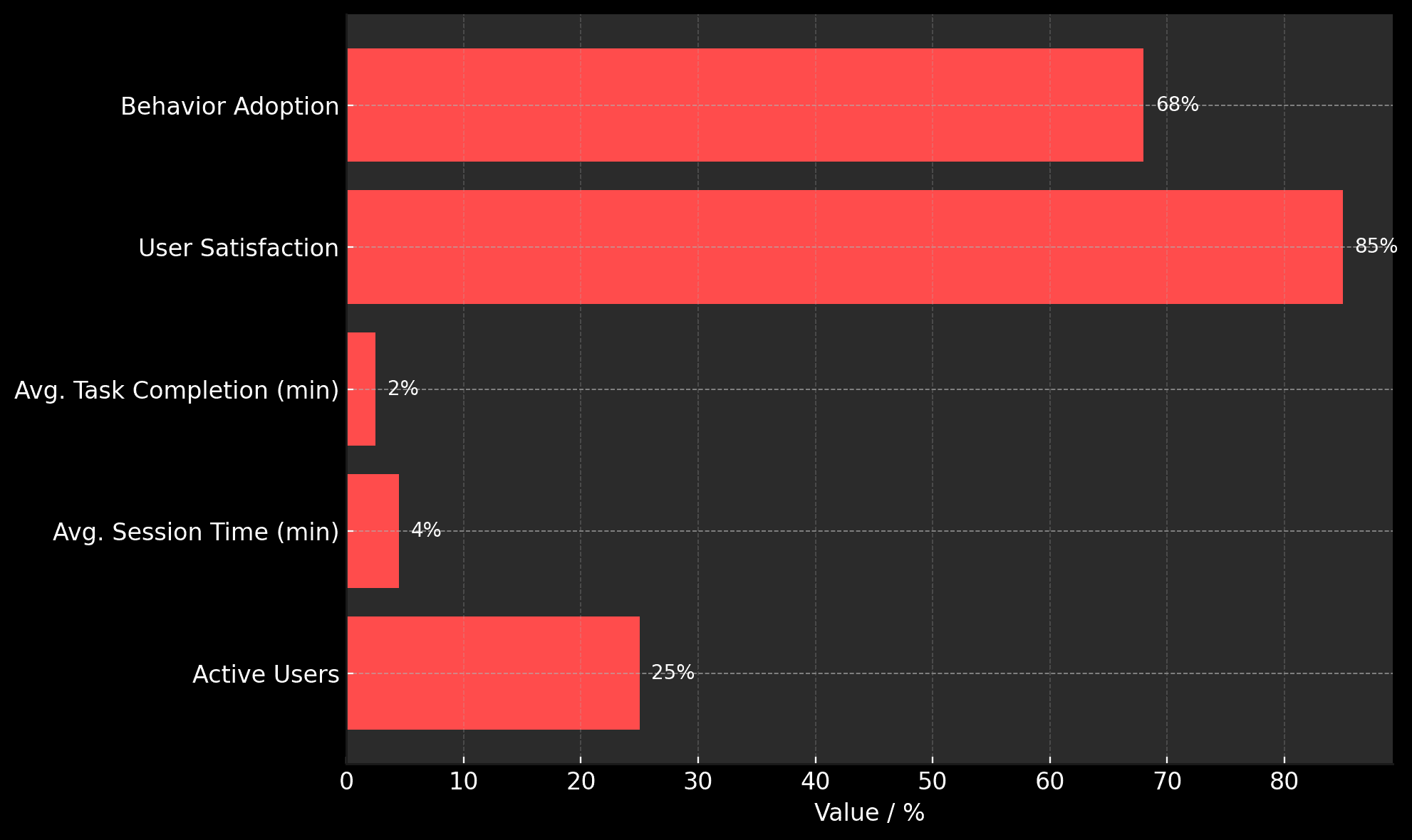
The launch blew us away:
Metric | Result |
|---|---|
Active Users | 10,000 (25% over target) |
Avg. Session Time | 4.5 minutes |
Avg. Task Completion (e.g., Join Challenge) | 2.5 minutes |
User Satisfaction (Survey) | 85% “very intuitive” |
Behavior Adoption (Follow-up Survey) | 68% started a new habit (e.g., meal planning) |
Metrics Comparison Chart: