Year
2024
Client
Washington State University
Category
Web Development / UI, UX
Product Duration
3 Months + Monitoring
Washington State University’s CCPRO website supported a wide range of users — researchers, students, and public health advocates — but the experience was fragmented and inefficient.
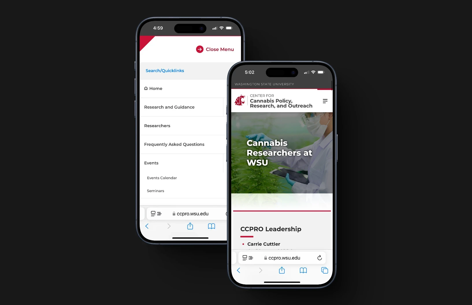
Key issue: users couldn’t quickly access scientific content, register for events, or find resources — especially on mobile.
The mandate was clear: improve task efficiency and accessibility for a diverse audience, without rebuilding the platform from scratch. We had 6 months and had to work within the university’s rigid, outdated CMS.
This case study focuses on solving one core challenge: making complex research content easy to find and use for researchers.
To understand where users were getting stuck and what they needed most, I led a focused discovery phase.
Stakeholder Interviews
I interviewed 12 internal stakeholders (researchers, staff, and donors). Top insights:
Researchers needed fast access to peer-reviewed studies
Staff lacked usable tools for managing events
Donors wanted to see research impact at a glance
These shaped measurable goals, like reducing time-to-find-study by 30%.
User Research
I led a team of 3 UX researchers to define key personas based on survey data (n=150) and usability testing (n=20).
Core Personas
Persona | Role | Key Goals | Pain Points |
|---|---|---|---|
Dr. Elena Torres | Cannabis researcher | Wants quick access to peer-reviewed, credible studies | Spends too long navigating to specific results |
Jake Simmons | Undergraduate student | Needs risk prevention materials for a class project | Struggles with dense academic language and poor search |
Sarah Nguyen | Public health advocate | Looks for upcoming events and community resources | Can’t find events easily, poor mobile experience |
Findings:
65% of users couldn’t locate specific studies
80% rated the mobile experience “poor” due to layout and responsiveness
Competitive Analysis
I audited 5 peer research portals. Most used:
Faceted search filters
Clean, modular layouts
Minimalist navigation
This informed our direction — clarity and structure mattered more than academic polish.
With clear user goals, I translated insights into tangible UX improvements.
User Flows
I mapped out flows for each persona.
For Dr. Torres, I prioritized a global search bar with filters by study type and date.
Her path to a relevant PDF was reduced from 8 clicks to 3.
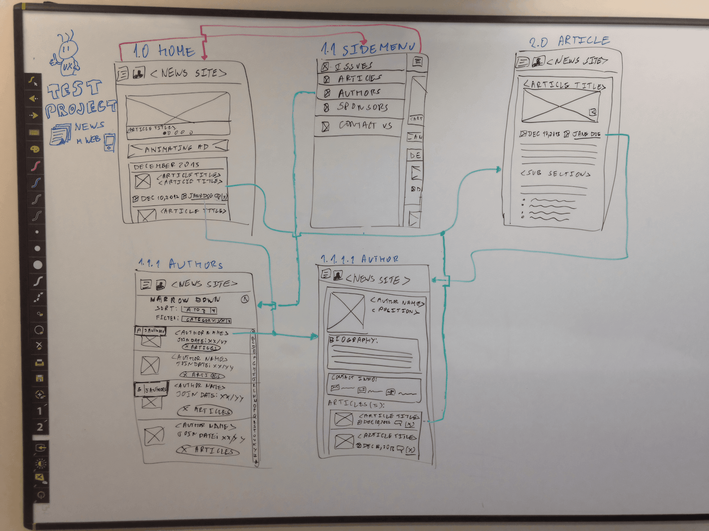
Wireframes
Designed low-fidelity wireframes for 5 core pages (Home, Research Library, Events, About, Contact).
Key decisions:
Modular grid (8px base) for scalable layout
High-contrast palette (#1A3C34 primary) meeting WCAG AA
Font: Open Sans for maximum legibility
Design reviews led to key adjustments, like enlarging CTA buttons by 20% for mobile accessibility.
Prototyping + Testing
Built interactive Figma prototypes with dynamic search and real-time form validation.
Tested with 15 users across personas. Key fix:
40% of users missed the “Events” tab, so I moved it to primary nav, reducing task time by 15 seconds.

In the first month after launch:
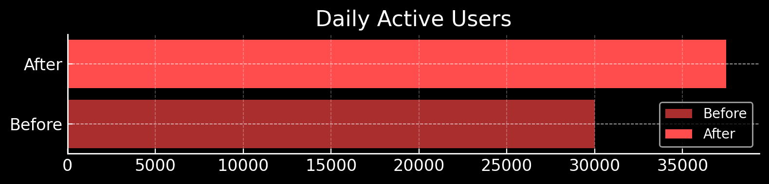
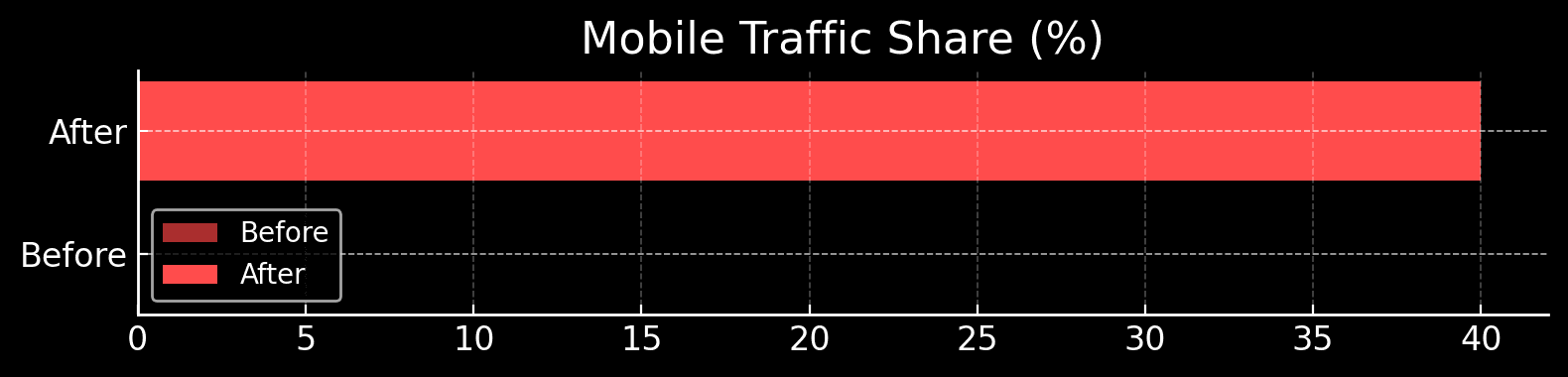
Metric | Before | After | Delta |
|---|---|---|---|
Daily Active Users | 30,000 | 37,500 | ↑ +25% |
Mobile Traffic Share | — | +40% | ↑ +40% |
Avg. Task Completion | 8 steps | 3 steps | ↓ −62% |
Navigation Error (Events) | 40% missed | 5% missed | ↓ −87.5% |
Visual Comparison Chart: